Project Overview 📘
UCI Now is a mobile app that allows the UCI community to view events and make reservations for study rooms. After analyzing its user experience, I concluded that a redesign would improve its information architecture, consistency, navigation, and scalability. This project was unfortunately unfinished due to prioritizing other projects, so I didn’t get the opportunity to redesign the entire application. However, this case study will demonstrate the effectiveness of its redesign by detailing the redesign of the events page and explaining next steps to bringing a full redesign into fruition.
Problem 💢
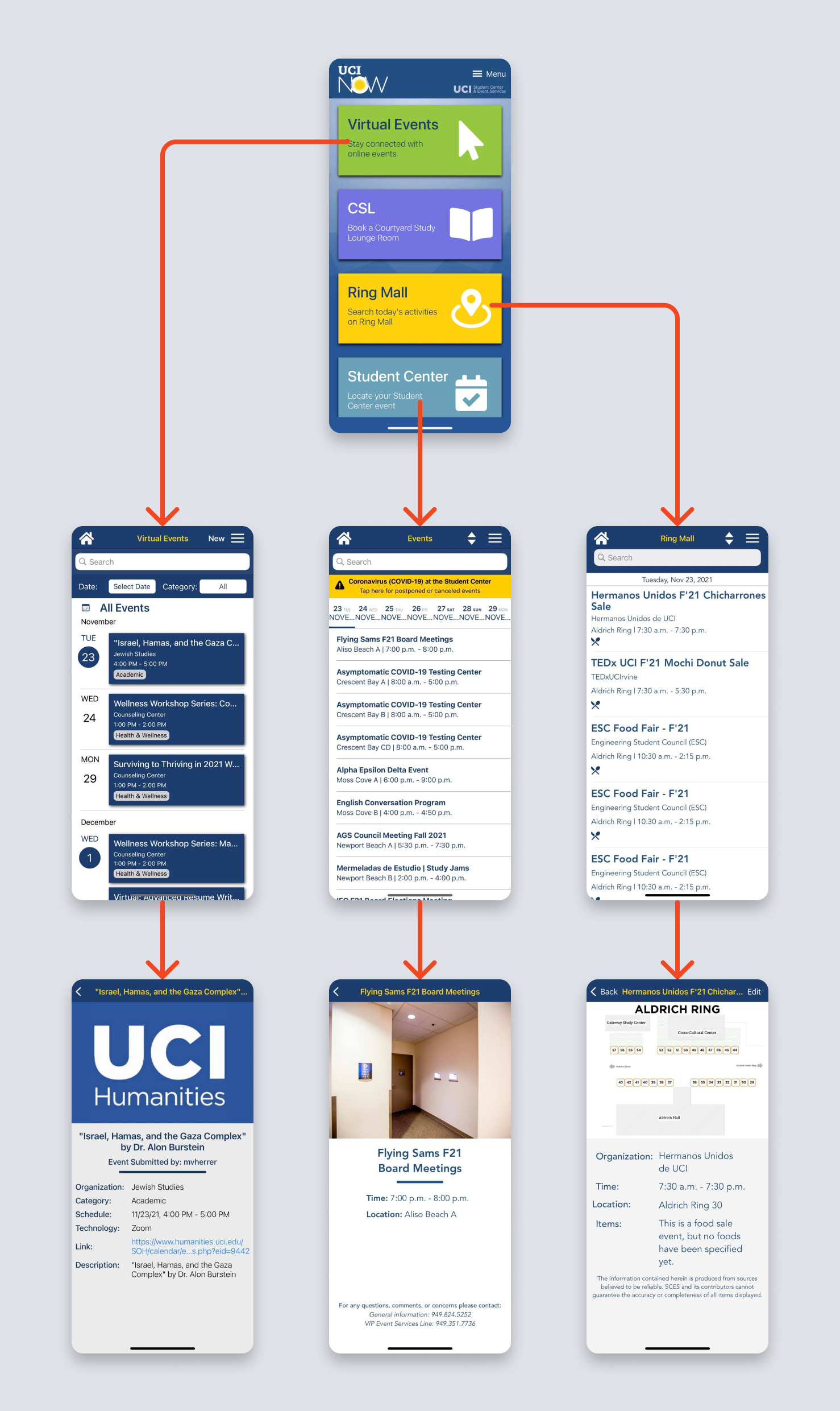
The UCI Now app is functional, but its information architecture is questionable. A home page diverges into other pages. Some of these pages share similar purposes, yet have inconsistent styling. For example, on the home page, there are buttons that lead to Virtual Events, Student Center Events, and Ring Mall Events. Each of those pages are inconsistent, and the individual events within those pages are also inconsistent.

Solution 💡
Combine similar pages into one for more organization. And have a tabbed redesign for ease of navigation, so that the user doesn’t have to return to the home screen every time they want to view a different page.
Design 💻
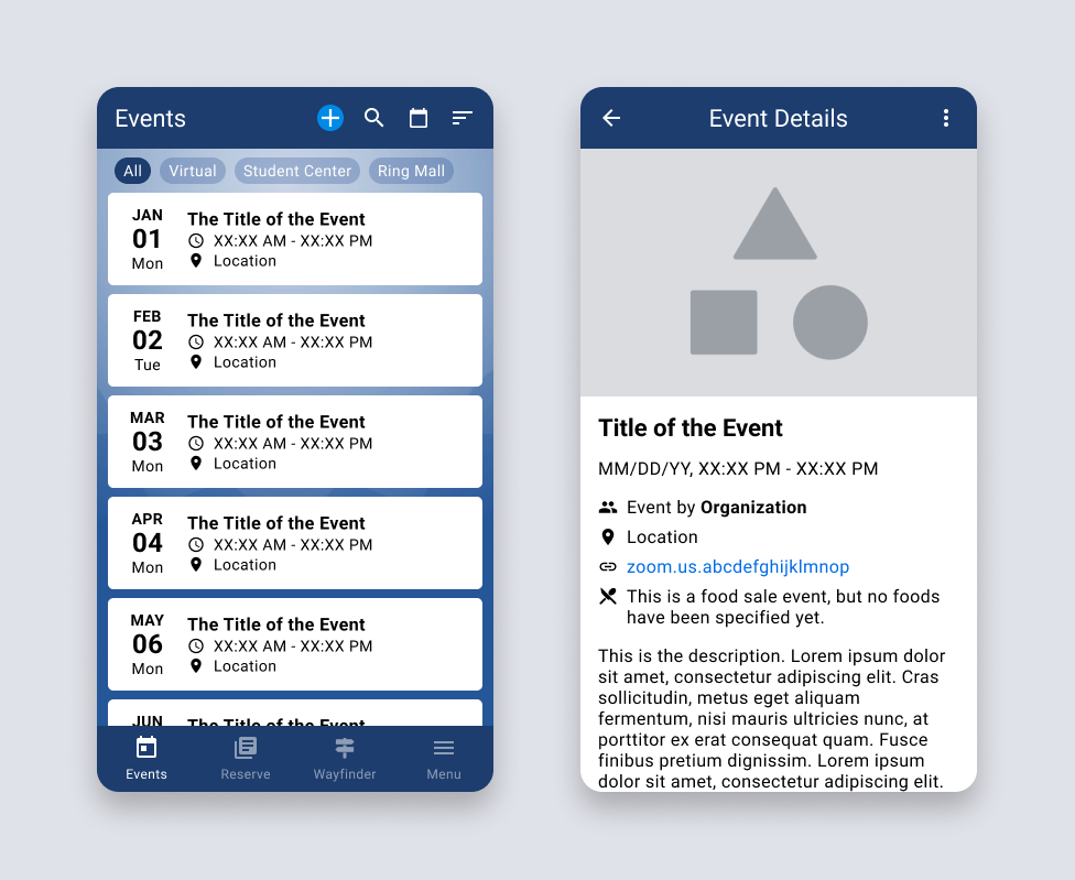
The three separate events pages have been consolidated into a single Events page, with the option to filter them by location (Virtual, Student Center, or Ring Mall). It also keeps functionality from the original, allowing the user to search, jump to a date, and sort. Now, there’s also unified styling for every individual event.

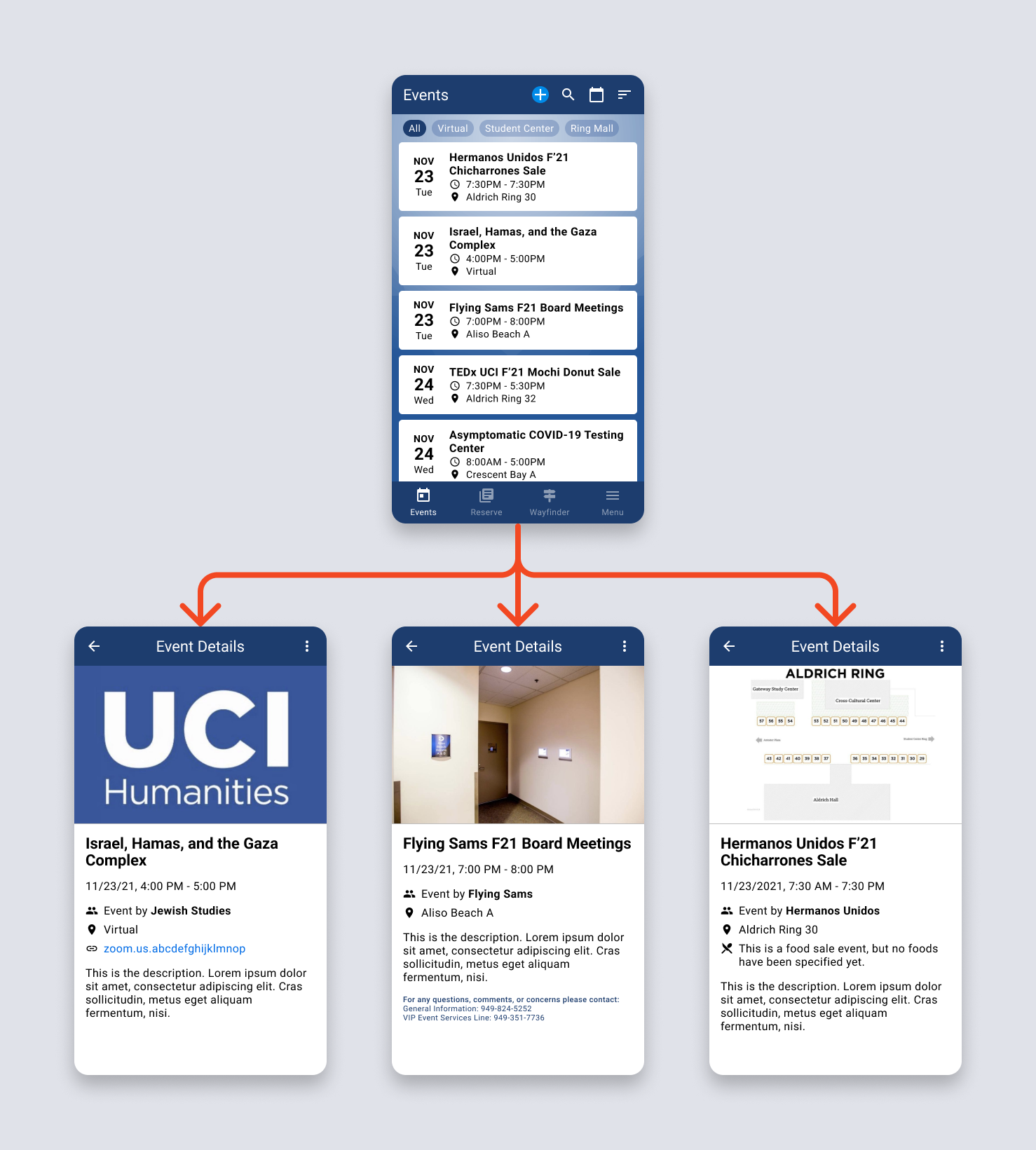
Here’s a demonstration of the new user flow, with the template fields now populated with information:

Next Steps 🤔
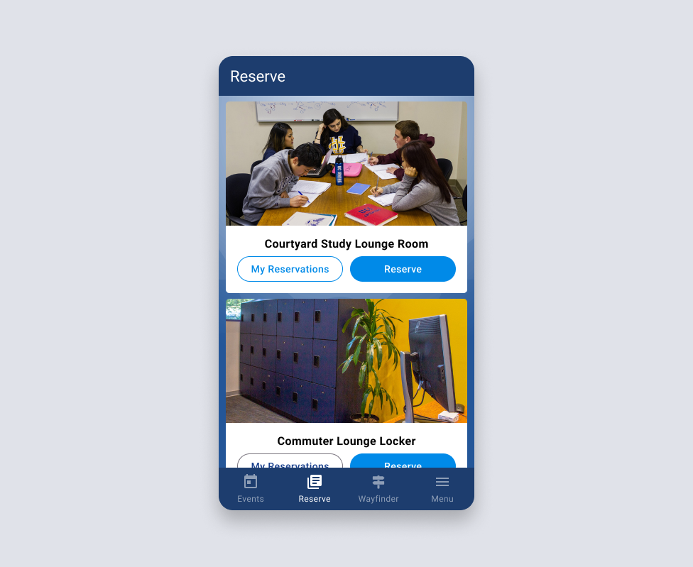
The Student Center is always growing and finding new spaces for students to reserve. Recently, they opened a commuter lounge with lockers that can be reserved for the day. Currently, the only way to reserve a locker is on the web. But in the future, it’d be ideal to include this in the UCI Now app, which already allows for study room reservations.
With the tabbed redesign, adding a new reservation is seamless. Instead of tacking on another button on the original home page every time a new reservation type is needed, it can be consolidated in the reservations page in the new redesign.

Before beginning development work and pushing this into production, user testing should be conducted to validate the effectiveness of the redesign. These should include moderated A/B testing of the old and new design, which can gather quantitative data on how long it takes to complete certain tasks, and qualitative data on how users feel about changes.
